Client
LeMessurier
—
Agency
Design & Co.
—
Services
Brand Identity
Brand Strategy
Digital
Print
Photography
—
Photography
Design & Co.
LeMessurier
—
Industry
Design & Architecture
Professional Services
Challenge
With over fifty years of experience building iconic landmarks such as the Embassy of the United States, Citicorp Tower, and The Federal Reserve Bank of Boston, LeMessurier is one of the prominent American structural engineering companies in the country. The firm works with architects, developers, contractors, and owners to evaluate and design structures that utilize the best technologies and materials available.
The company was turning a new leaf—going digital, taking on more international projects, and adding new faces to its growing team of engineers. Our challenge was to redefine LeMessurier's brand as a service and technology leader in the engineering industry.
Solution
Working in collaboration with Design & Co. and the firm's select committee, we created a bold new brand for LeMessurier that captures its service-centric and technology-focused approach in a vibrant identity and a modern digital presence.
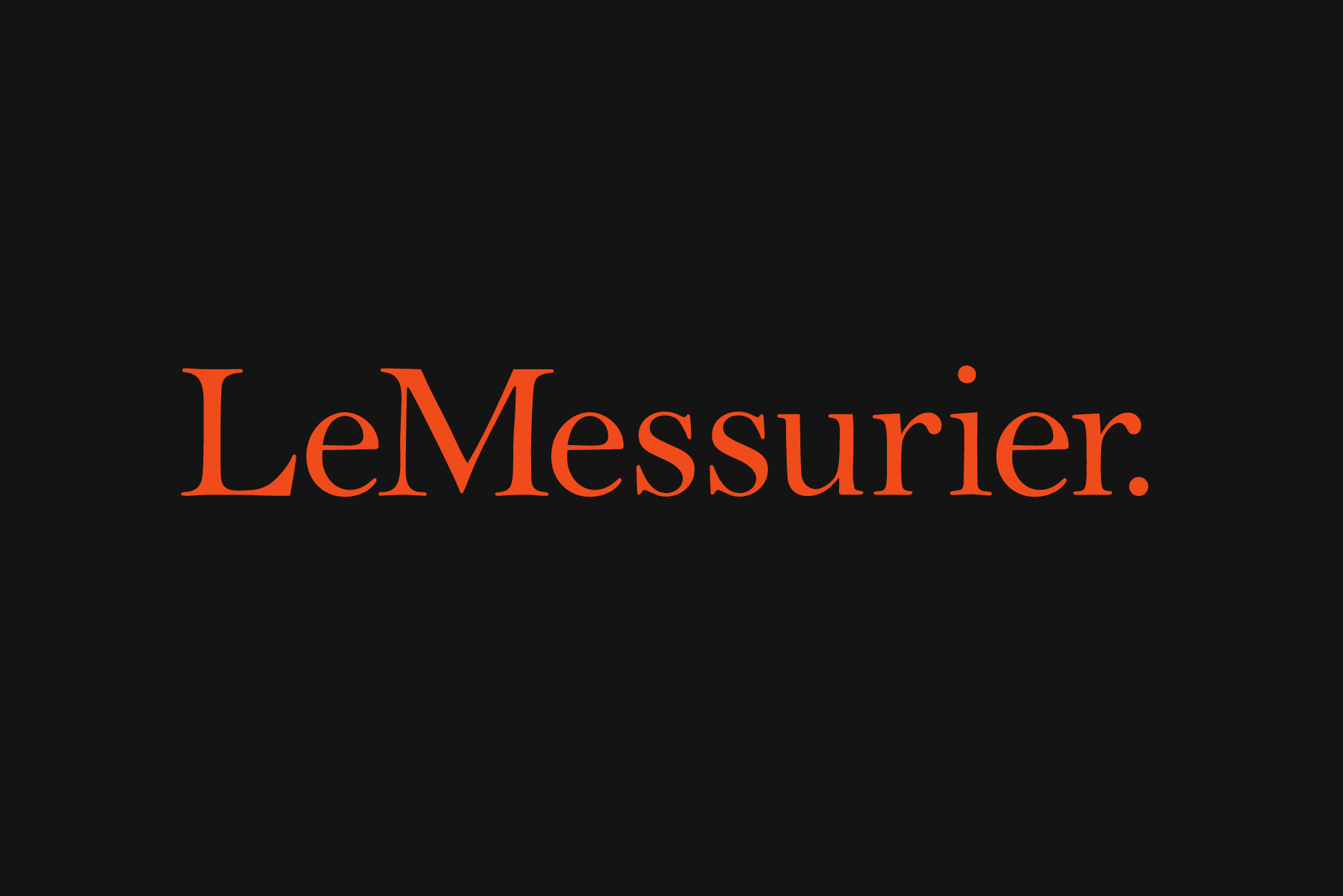
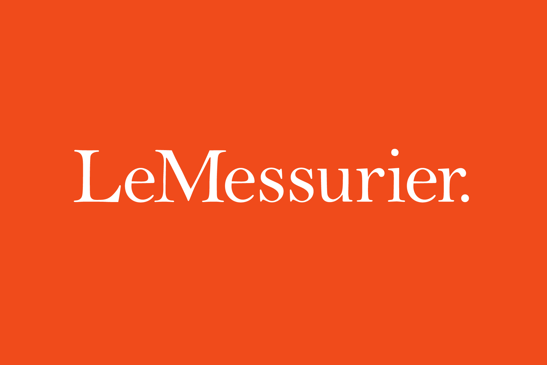
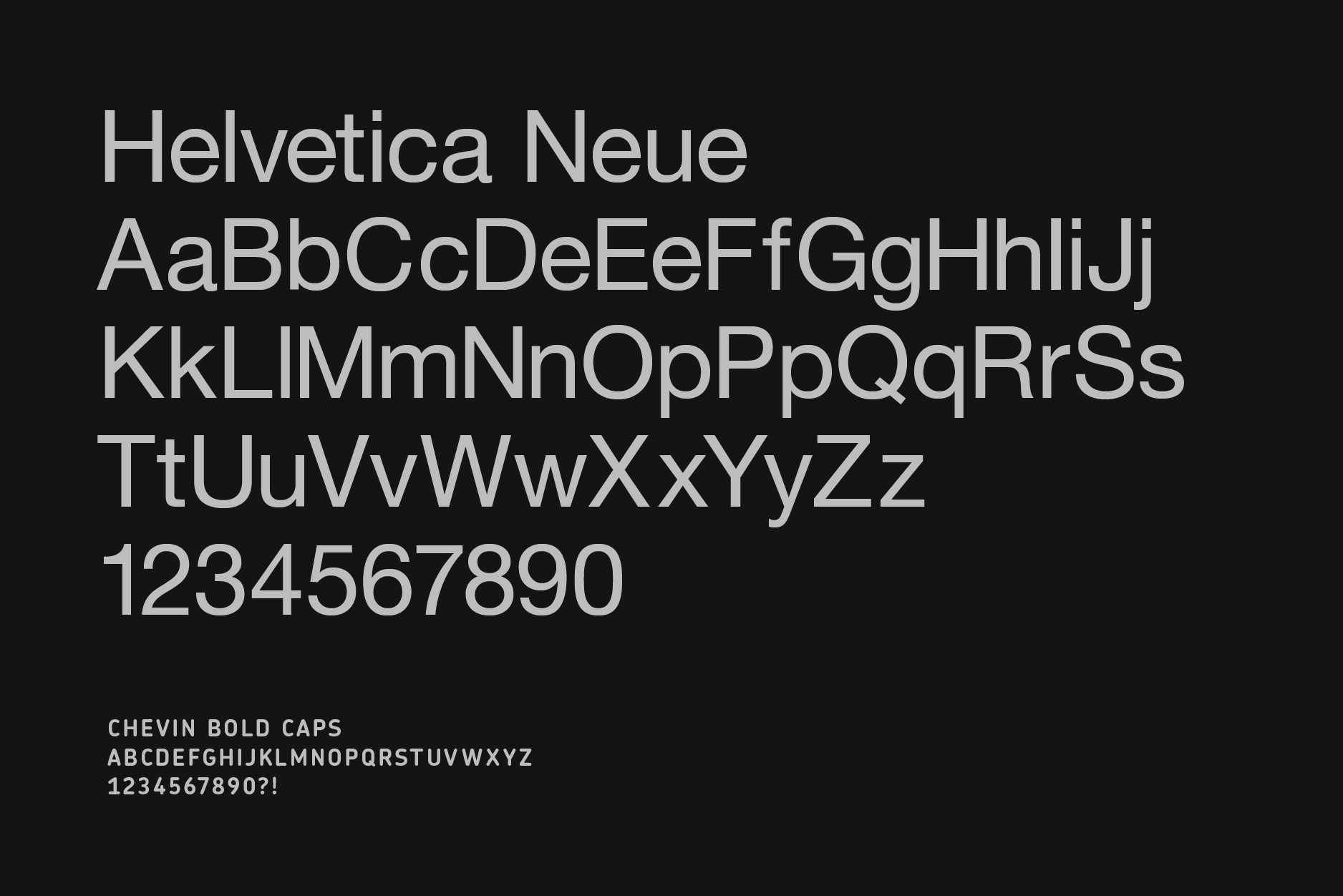
We started by changing the name of the company from the LeMessurier Consultants to a simple and current—LeMessurier. Following the name change, we introduced a new company logo, set in an elegant Bell MT. The elegant serif font provides a breath of fresh air in an industry dominated by heavy and largely all-caps sans serif identities. The new logotype is set in a bright orange alongside a mix of muted warm greys which provide contrast. The palette is applied extensively across all print and digital communications. Helvetica Neue and Chevin by G-type are used throughout to provide clarity and legibility across all of the brand communications.
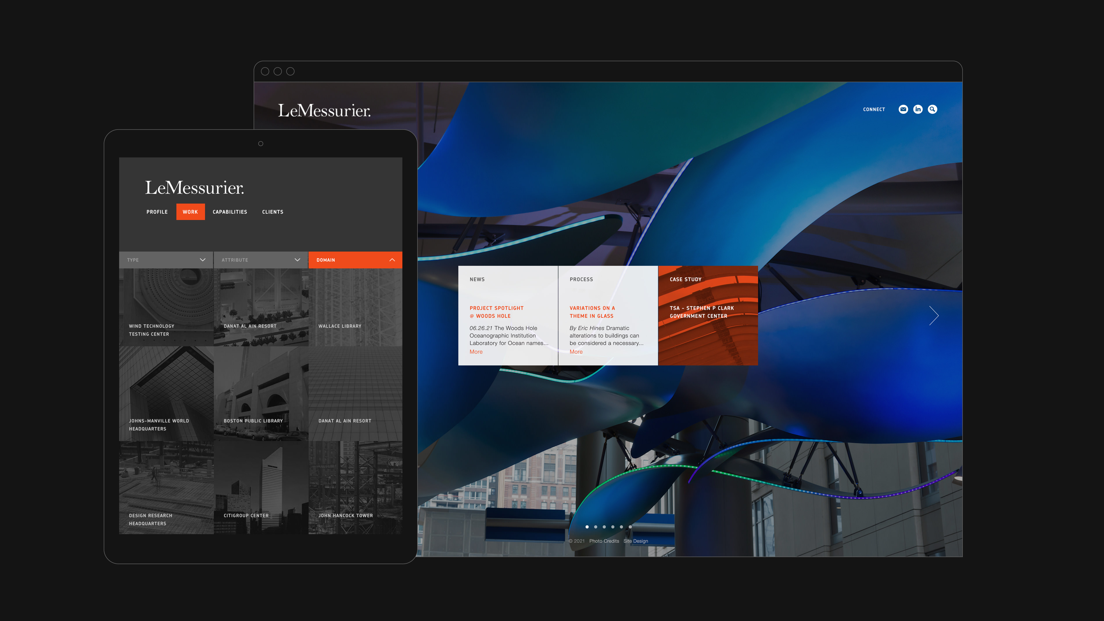
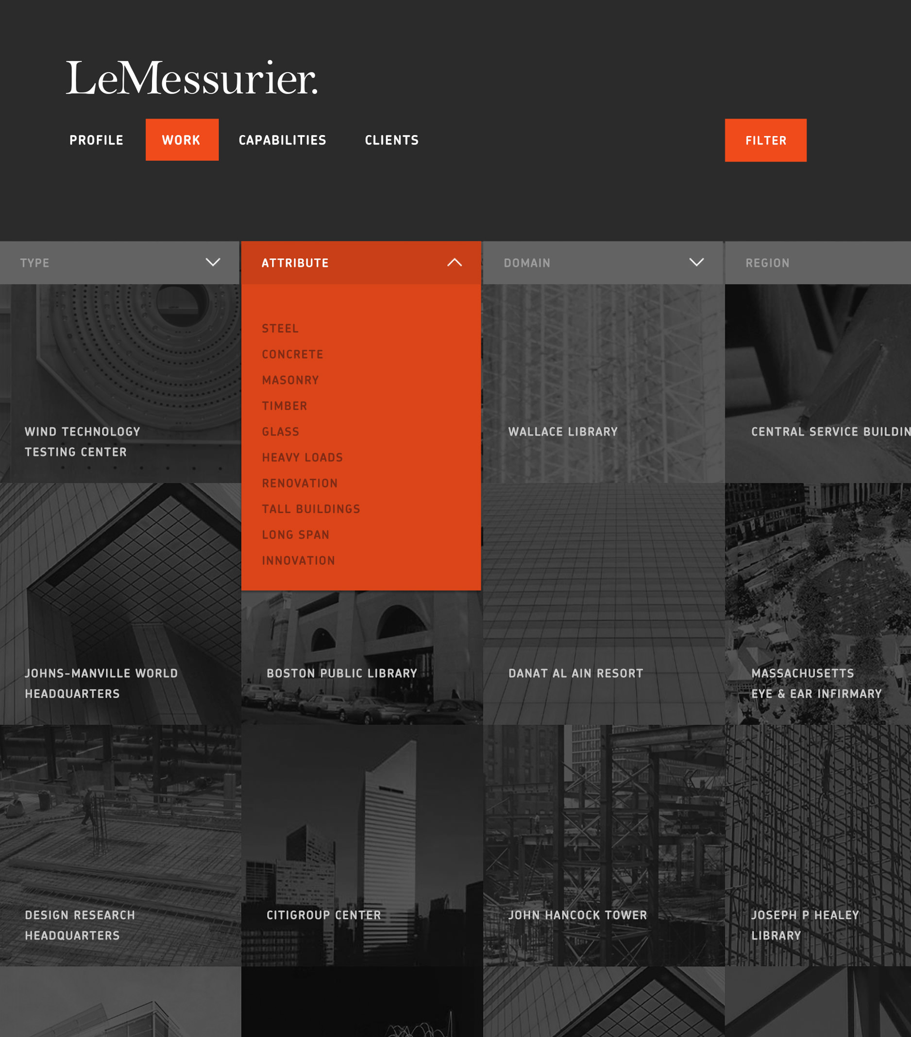
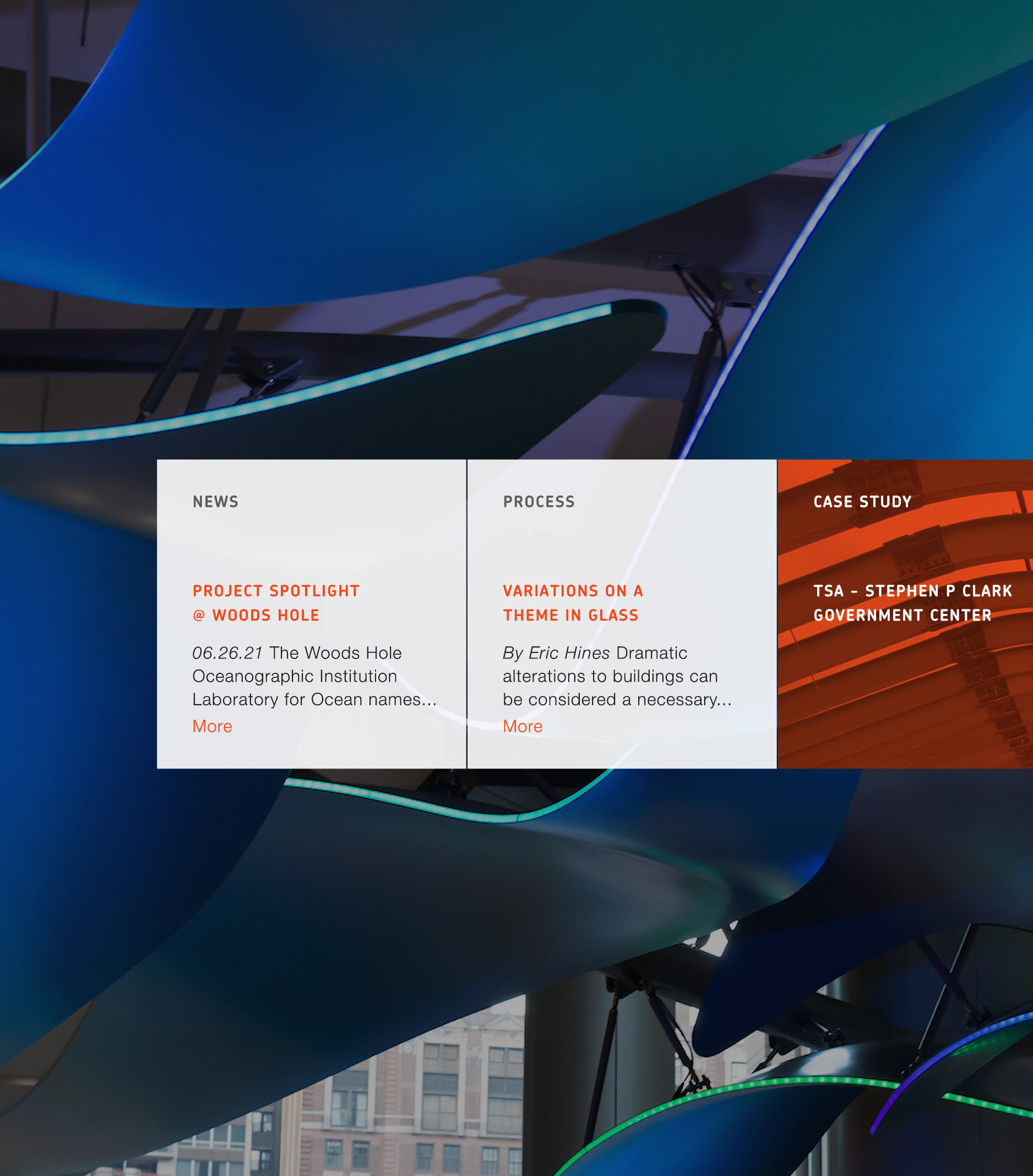
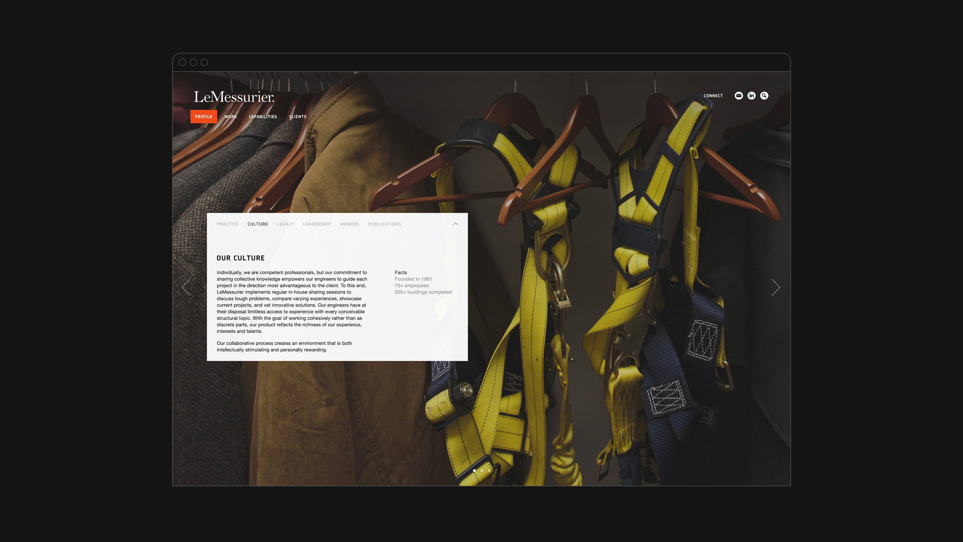
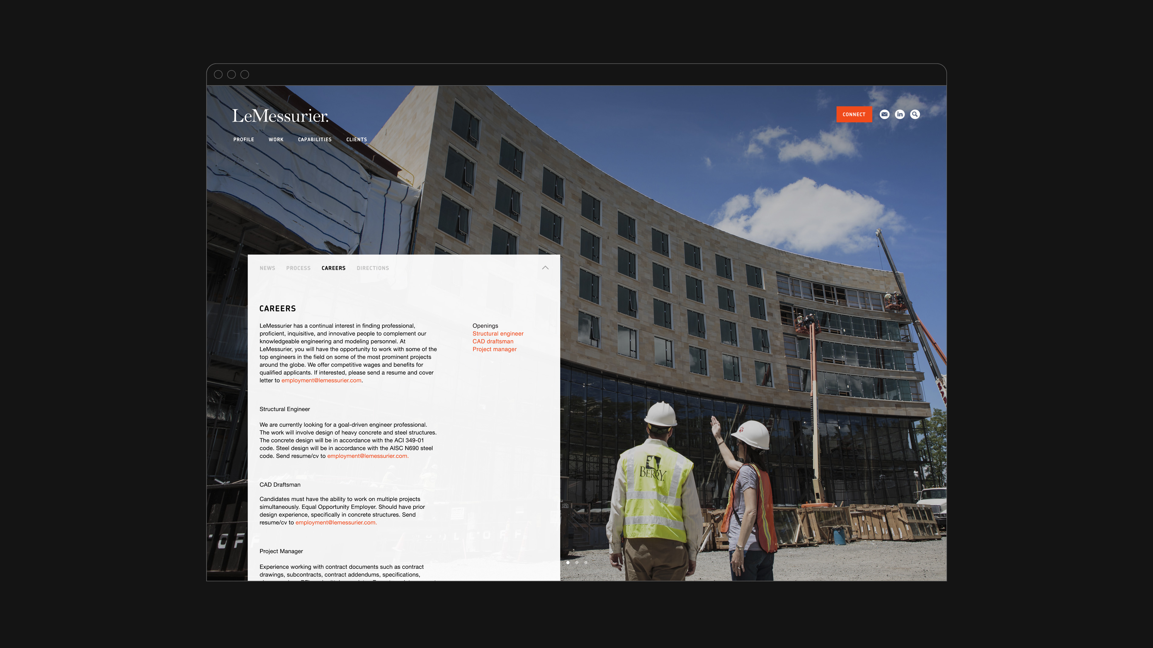
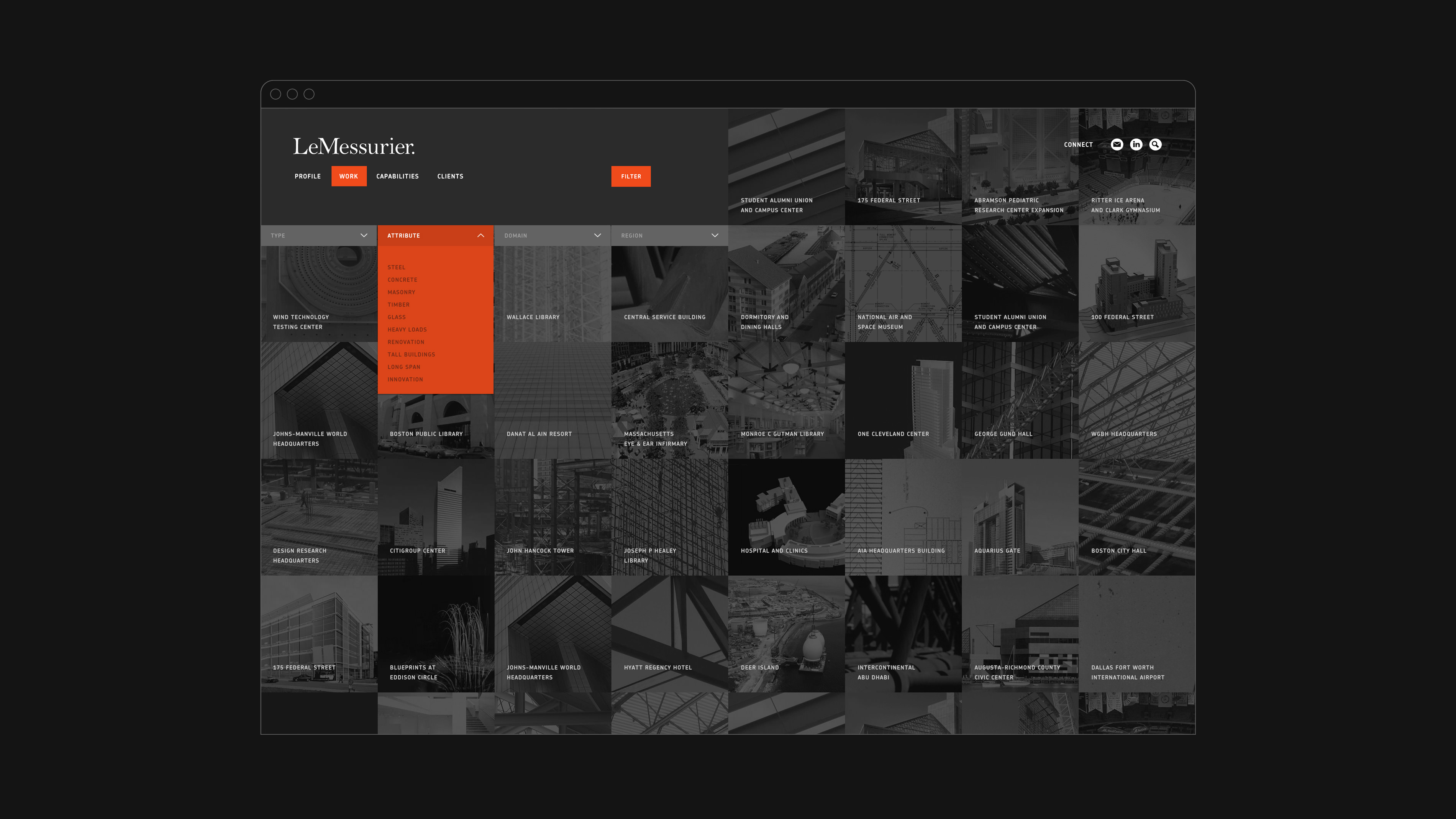
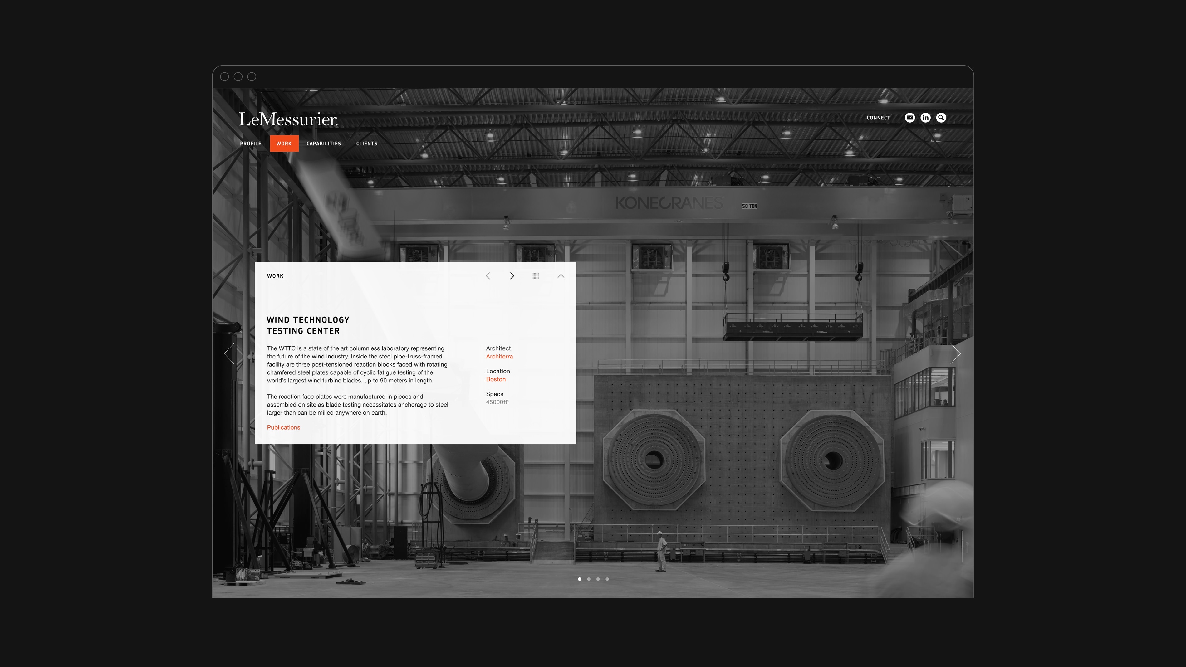
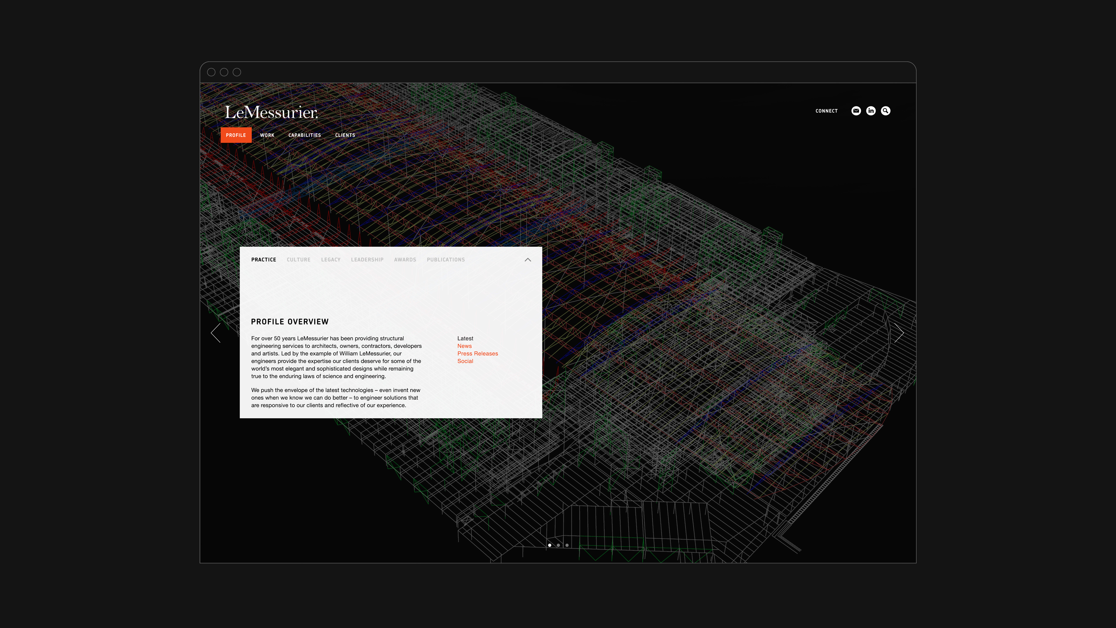
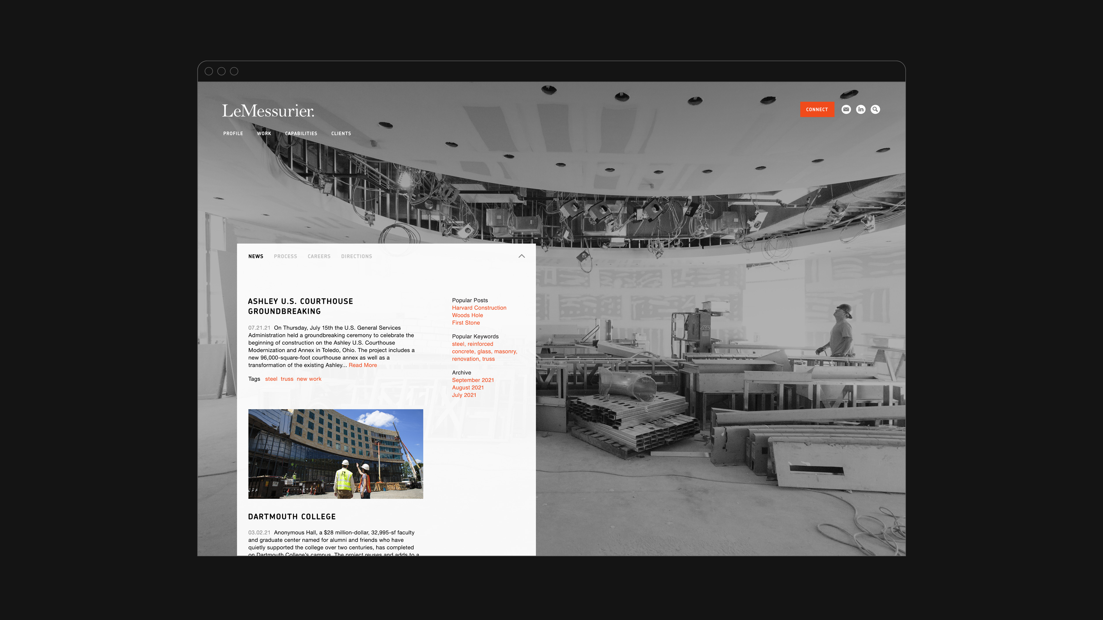
The website features LeMessurier's comprehensive body of work and provides a personal insight into the LeMessurier team. The homepage showcases a collection of immersive in-progress and finished work imagery with quick links to the latest projects, featured work, news, social posts, as well as an extensive collection of research papers—a nod to the firm's academic roots. The “Work” page features a powerful system of filters that provide live results by dynamically animating the project grid. On the back-end, the website is driven by an intuitive and easy-to-use content management system.
Winner of the SMPS Boston First Place award in 2014.
Metrics
50% Increase in traffic
65% Increase in unique visitors
Share
Twitter LinkedIn Facebook
The elegant serif font provides a breath of fresh air in an industry dominated by heavy and largely all-caps sans serif identities.
“The science and service of engineering.”
– Bill Lemessurier
Related
Let’s talk!
gary@studiopiko.com
+1 339 927 0405
