Client
C Space
—
Collaboration
Franco Bonadio
—
Services
Brand Identity
Brand Strategy
Digital
App Design
Illustration
—
Industry
Technology
Retail
Challenge
The egg—it's a timeless symbol of birth and is one of nature's most elegant and enduring forms. The first egg hatchling took its baby steps over 300 million years ago, as reptiles began to appear on earth. The design of the egg hasn’t changed since.
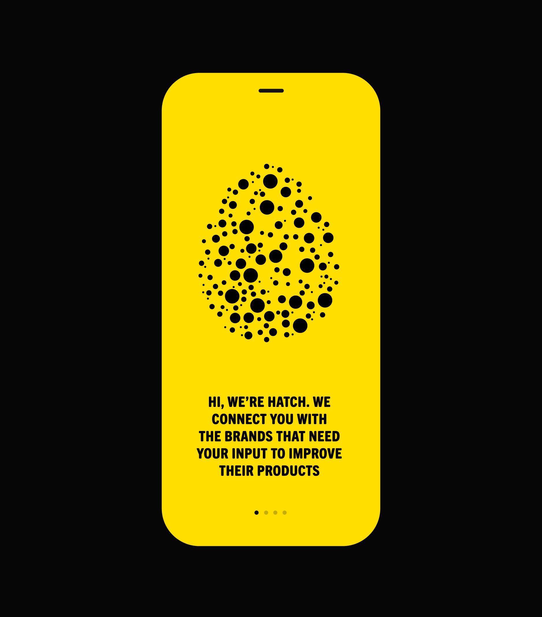
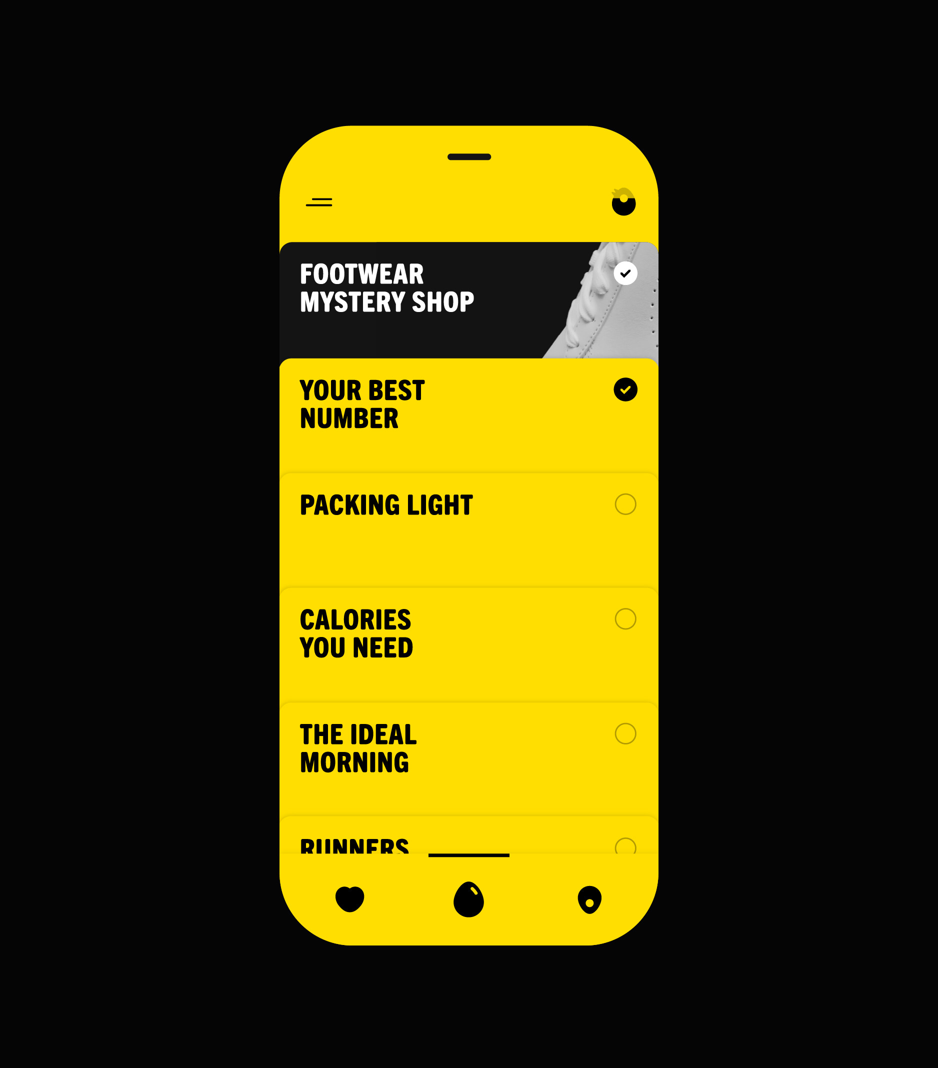
The egg became our foundation while collaborating with C Space on the brand identity for a fun consumer experience app initially called Presto. (Renamed to Hatch in the process). The app would connect people and brands to create better products and services. Brands would provide incentives for people to test their products. In turn, people would get significant rewards for their feedback. Studio Piko was asked to develop the identity system and the app for the new brand.
Solution
Together with C Space, Studio Piko created a new identity and mobile app for Hatch that embodies the brand's bold spirit and provides users with a simple and fun in-app experience.
Our goal was to make the atmosphere friendly, fresh, and approachable. As a first step, we decided to invigorate the vibe by changing the name of the app from Presto to Hatch—a nod to a place where ideas come to life. The name took off. A bright yellow combined with a strong and unapologetic black became the basis for the new color palette.
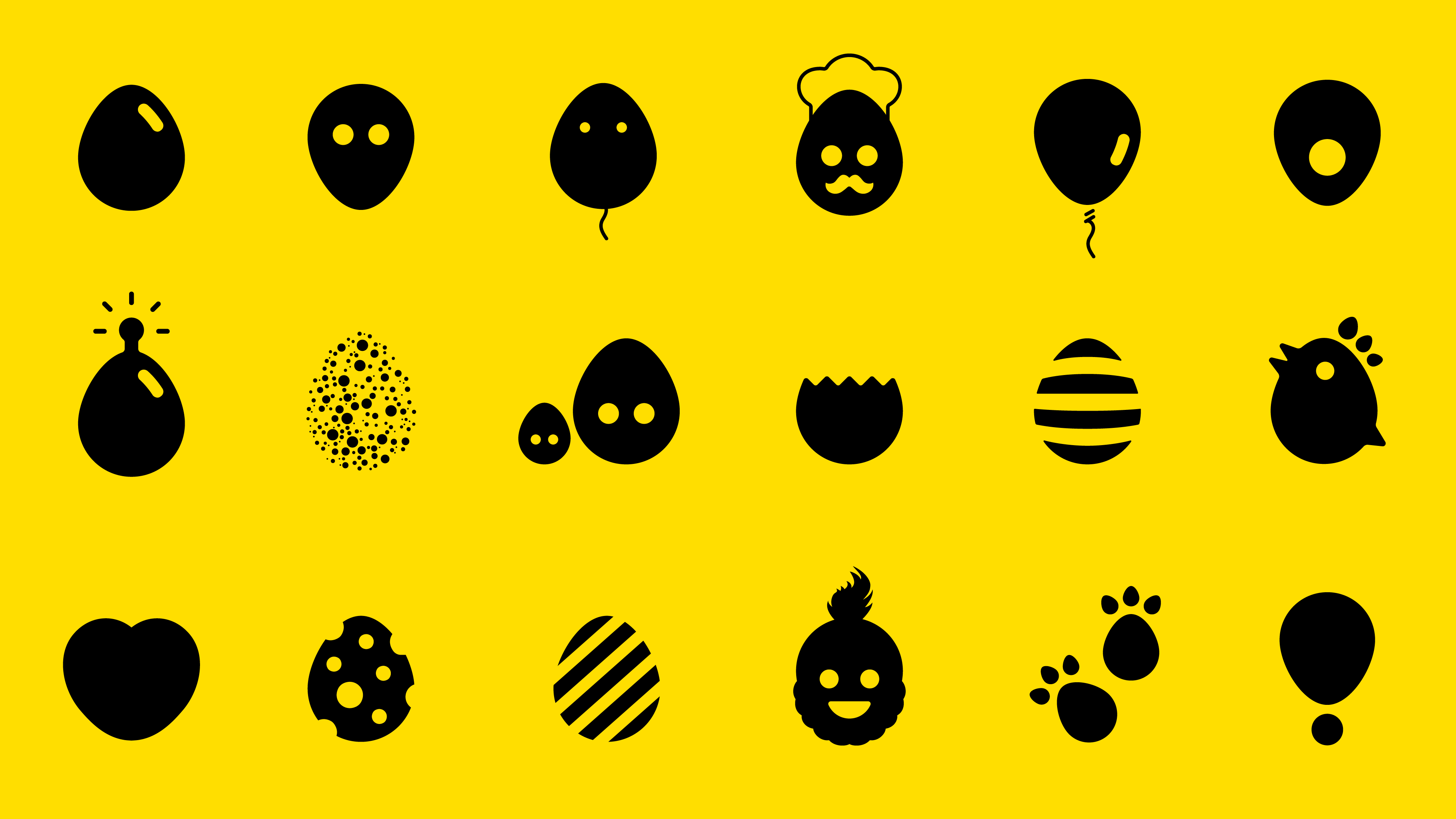
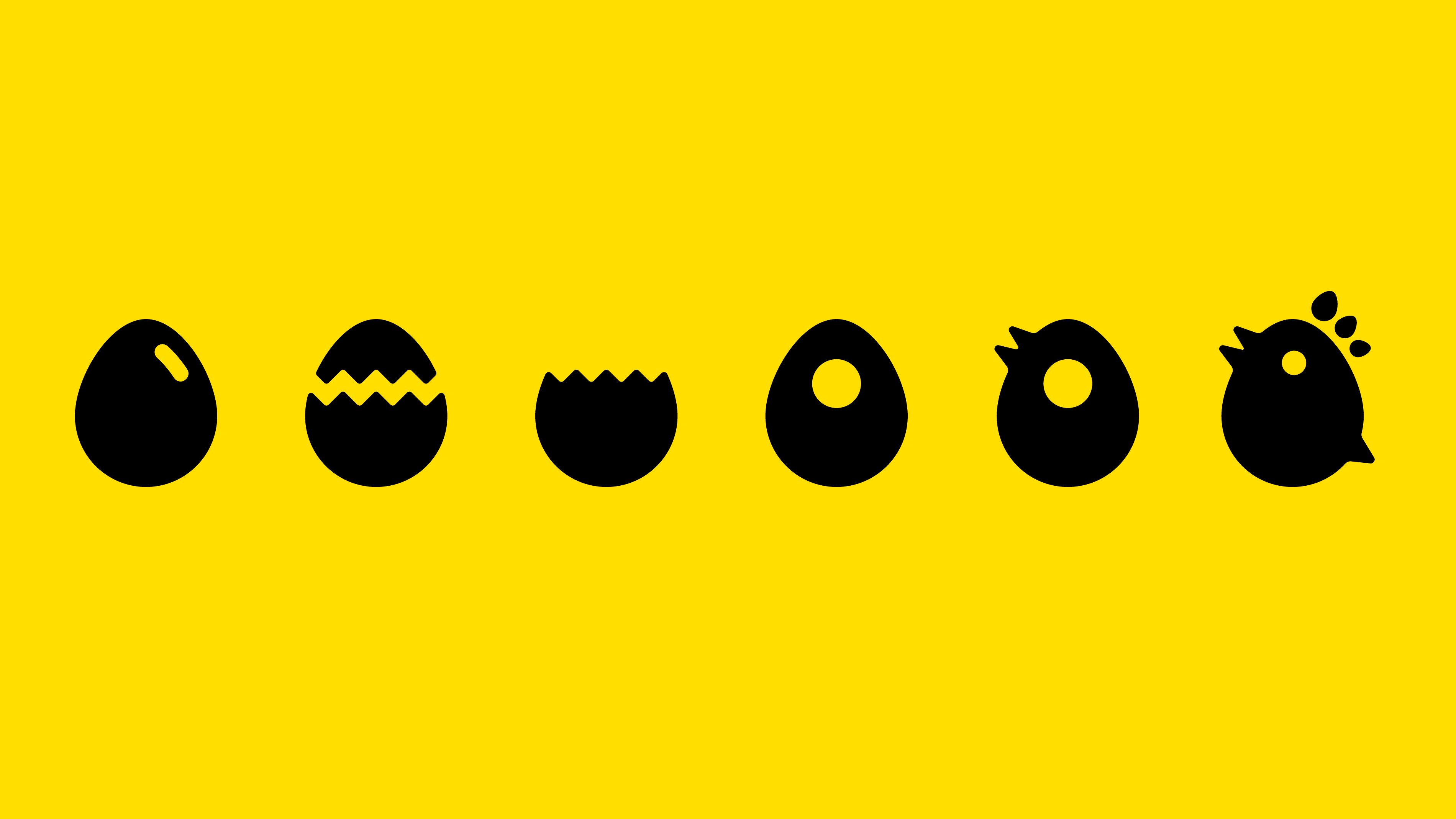
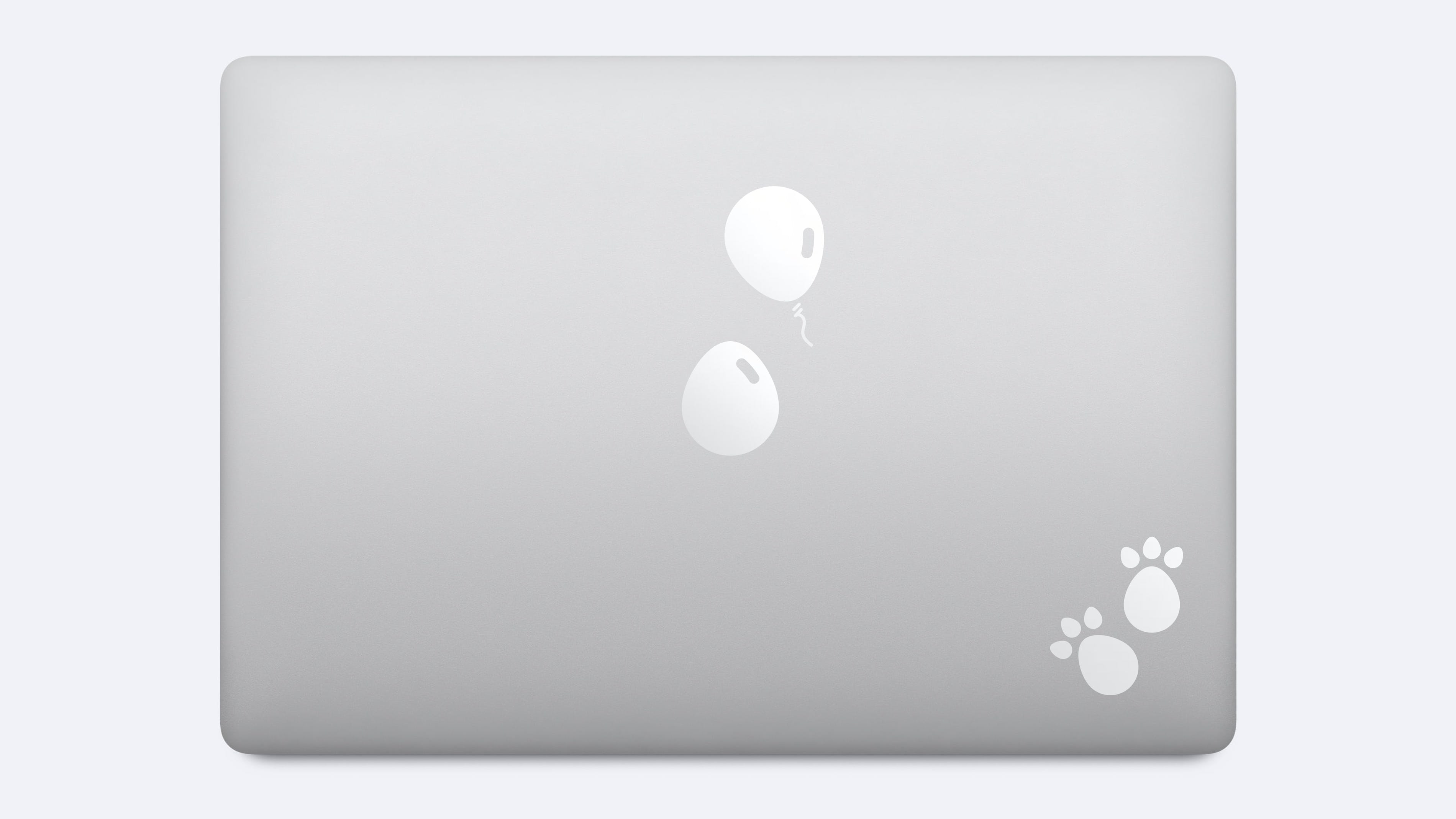
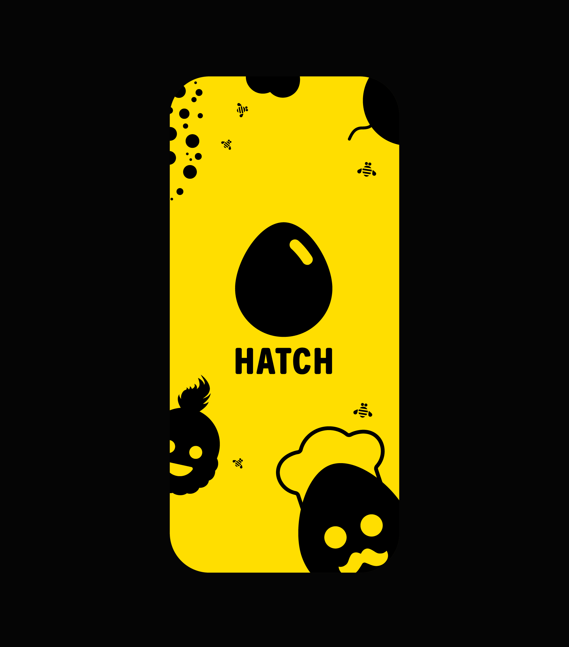
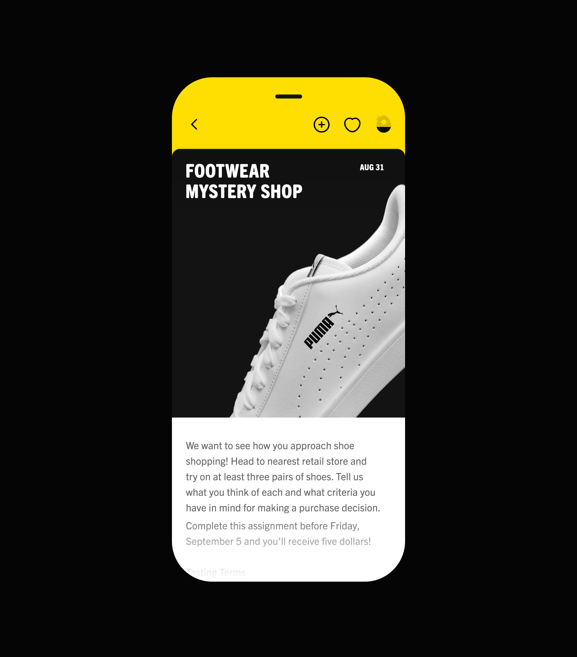
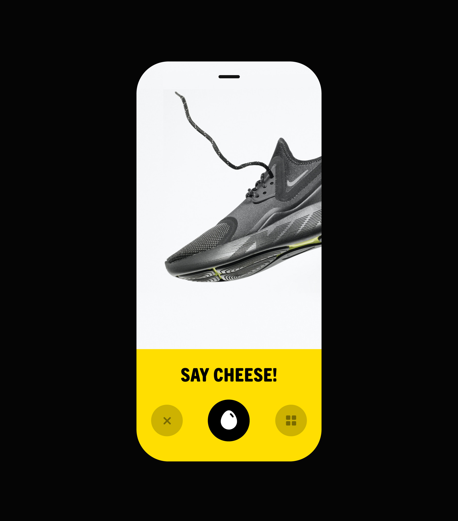
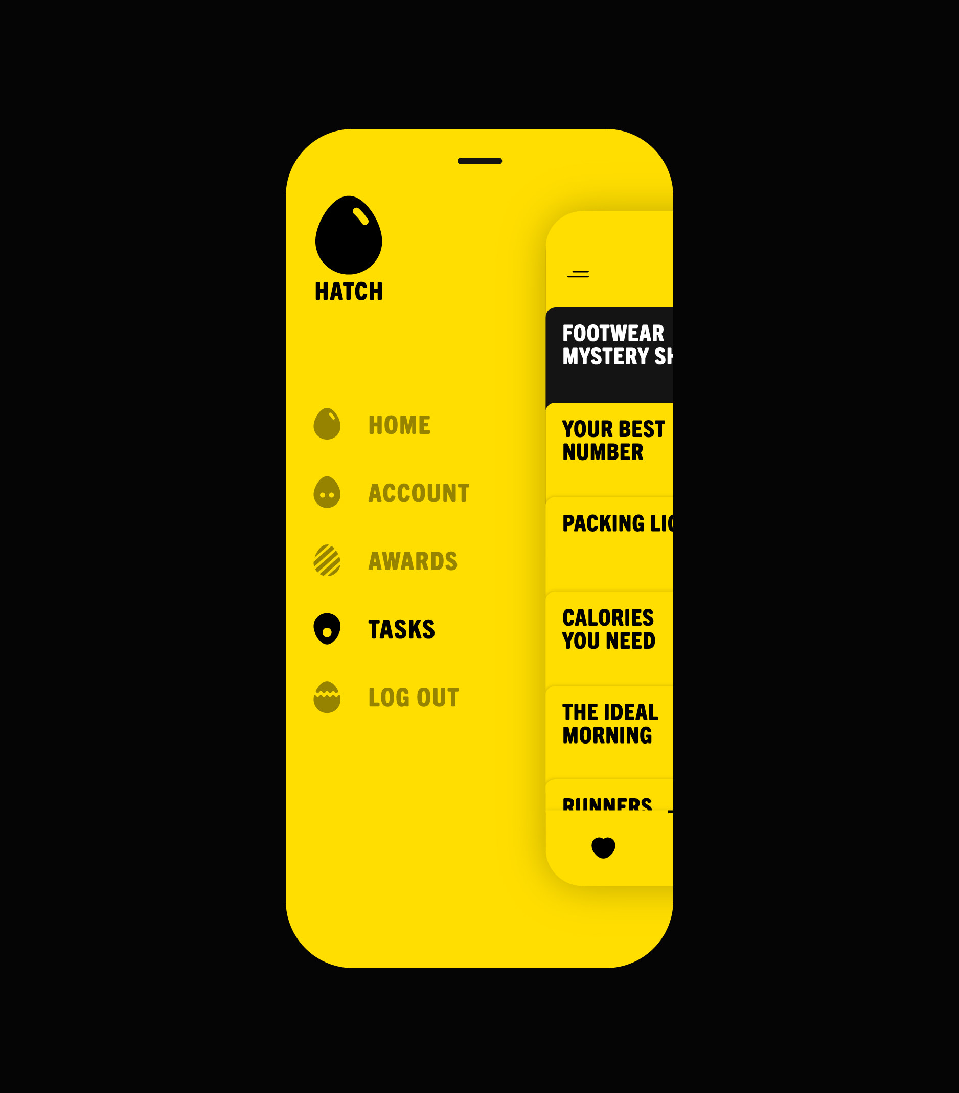
The egg started to take on life, morphing into witty characters, shapes and becoming a core part of in-app UI. For example, as one accomplishes various tasks in the app, an egg-shaped progress bar begins to wiggle, crack, and eventually hatch. Users are encouraged to finish assignments by hatching birds or other animals as awards for completion. The various egg characters are also featured in the onboarding guide and in-app navigation. For the old-school fans, the egg characters come in a set of stickers.
The new app received an overwhelmingly positive reaction, registering thousands of downloads and quickly competing with the highest-grossing apps in its category. On our end, we had a blast crafting and developing the various egg characters and learned a thing or two about game theory.
Share
Twitter LinkedIn Facebook
The egg. Born out of the company name, the egg shape started to take on life, morphing into witty characters, shapes and becoming a core part of in-app UI.
The app experience. As one accomplishes various tasks in the app, an egg-shaped progress bar begins to wiggle, crack, and eventually hatch.
Related
Let’s talk!
gary@studiopiko.com
+1 339 927 0405
